I have been working with a few organizations helping with their user adoption of Microsoft/Office 365 tools and services. Analyzing various Microsoft/Office 365 admin reports forms a core part of that exercise, which provides a fair understanding of usage patterns of various tools. However, it can quickly become overwhelming if we try to identify say top 5% of users who are making most/best use of the these tools, specially in medium to large organizations.
Problem Statement
As the introduction text explains, we are looking for a way to be able to easily find out users who are using various tools/services within Microsoft/Office 365 and probably classify them as Power Users/Highly Engaged Users for targeted communications about new features/changes, as they are more likely to act positively on such information.
So in a summary, what we need is to find out is, say top 5% of the users who are using a mix of Microsoft/Office 365 tools (like MS teams, SharePoint, OneDrive, Outlook, Yammer etc.).
Initial Thoughts
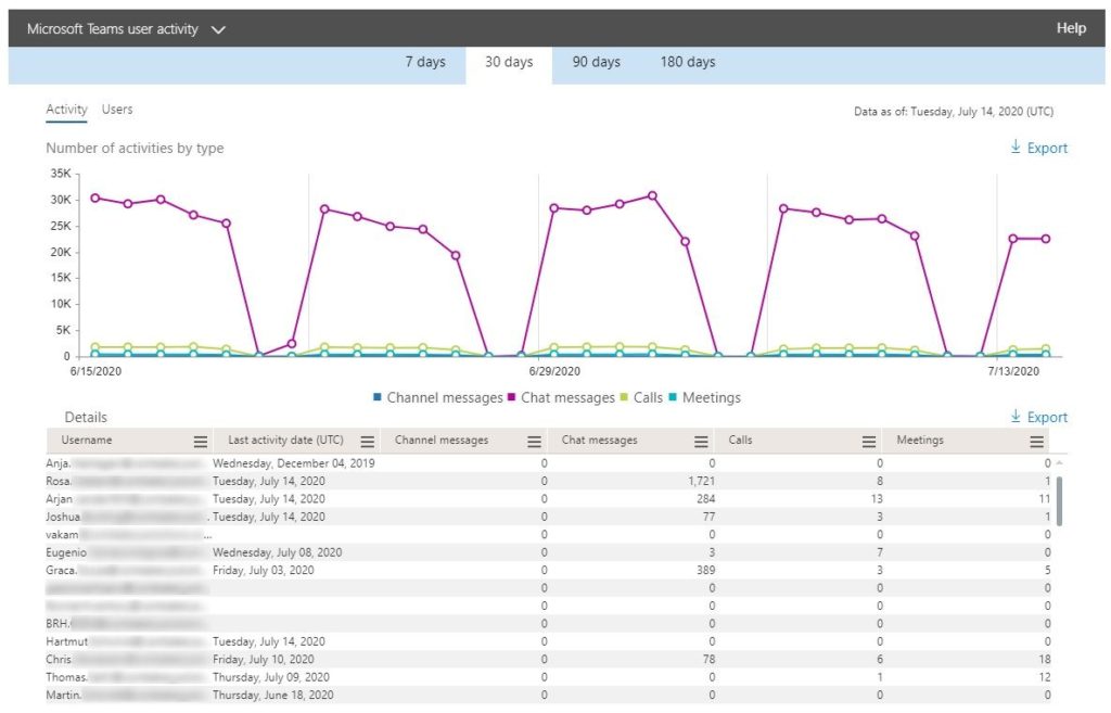
As it goes, the first option is always to look into what is available Out-of-box. Just going through some OOB reports from Microsoft/Office 365 Admin Center, like Microsoft Teams user activity or SharePoint user activity reports gives an idea about the way users are using various features.
Similar report for SharePoint looks like this. So, it has some details like Files viewed/edited, synced, Shared internally and externally etc.
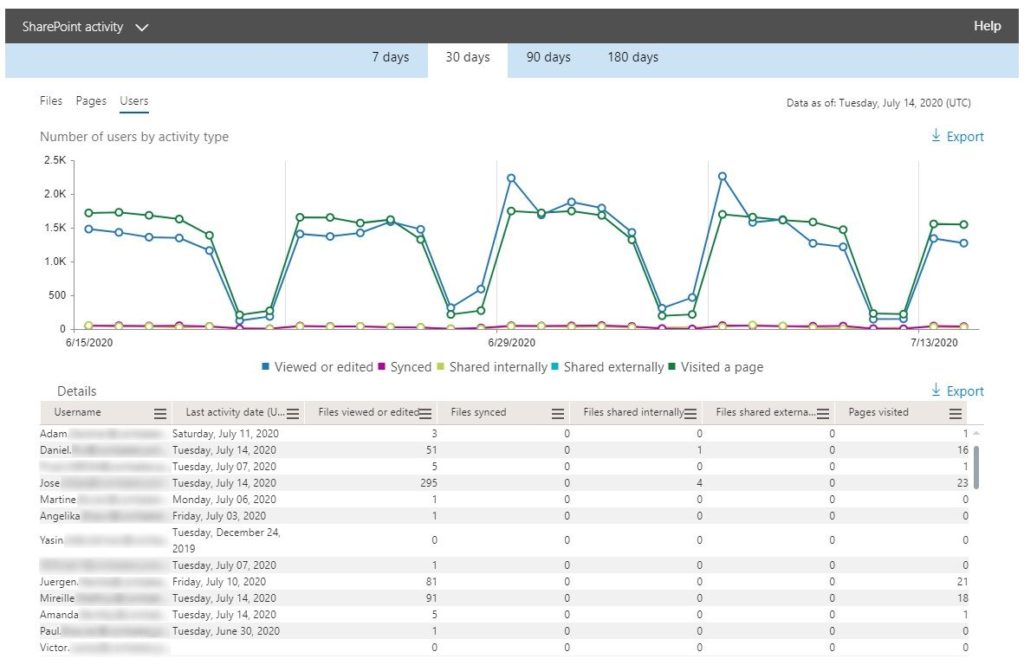
We can even export these reports to a csv format, open in excel and play with it. Like sort on various columns to find out who all are using a certain feature, like Files viewed/edited, the most.
It’s a really good start but when the number of users are huge and various applications are being used, it can get quickly overwhelming to identify who are are using a number features across various tools. It’s nearly impossible to keep track this way.
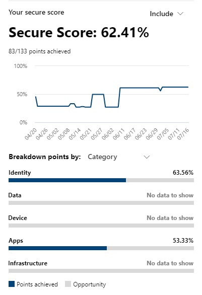
Microsoft Secure Score
Well, the heading here is a bit misleading and seems unrelated but the key takeaway is the “idea”! If you have ever looked at it, it looks into various security parameters of your office 365 tenant and provides a percentage score to give you the confidence about how well your tenant complies with security guidelines.
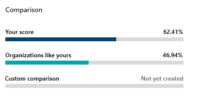
It even provides a kind of comparison with other organizations.
I like this idea!
What if we could do something similar based on the various activities found in Office 365 reports and assign a percentage value to each user? So, the idea is to analyse the reports, gather various activities details of each user, associate some weightage to each such activity and finally calculate a percentage score – Call it Collaboration Score of the user. We can even then put this data in use by developing secure score like charts and that can be our Collaboration Widget!
How to go about it
Charged with this idea which I made myself fully convinced with, I started to look for how to go about it and came up with these steps:
- Create a SharePoint list to store the master data about the calculation logic
- Use Graph API in a Flow/Power Automate to Get the usage details for various applications and store the data received from the API to another SharePoint List
- Use another flow to make the calculations based on the master data and store the calculated data in another list
- (optional): Use Power Automate to develop some graphical interface to visualize the calculated data
Easy peasy! Let’s jump into a bit more details now.
Calculation Logic
Ofcourse, You can make your own calculation logic but this this what I came up with. This is just an example for a couple of application, but it should give you the idea.
What we are going to store in the master list:
- Parameters: Like Emails Sent, Team Chat Messages etc.
- Weightage of that parameter: numerical weightage like 1, 1.5, 2 etc.
- Max activities count per day: This you need to come up yourself, something like 10 emails sent per day can be considered good enough collaboration. This is to avoid someone just sending a 100 mail a day to boost his/her collaboration score, while not using any other application at all.
- Number of days: Office 365 usage reports can be extracted as for last 7, 30, 90 and 180 days. For this example, we can set this to 7. This means, if you set the max activity count of Emails sent as 10, then maximum number of emails that will be considered for score will be 70.
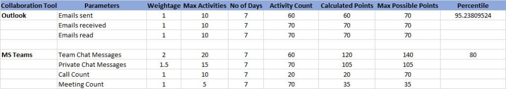
The table below should provide a good understanding of the above.
| Collaboration Tool | Parameters | Weightage | Max Activities | No of Days | Max Possible Points |
| Outlook | Emails sent | 1 | 10 | 7 | 70 |
| Emails received | 1 | 10 | 7 | 70 | |
| Emails read | 1 | 10 | 7 | 70 | |
| MS Teams | Team Chat Messages | 2 | 20 | 7 | 140 |
| Private Chat Messages | 1.5 | 15 | 7 | 105 | |
| Call Count | 1 | 10 | 7 | 70 | |
| Meeting Count | 1 | 5 | 7 | 35 |
You can create a SharePoint list and store these master data calculation data there. We can refer this list later to calculate the final score.
You can make it as simple or complex as you would like. But the idea here is to just showcase the possibilities
Get Usage Reports using Graph API
Now that we have our master data in a SharePoint list, let’s create another SharePoint list to store the usage data retrieved using Graph APIs. This list could have users’ UPN as rows and all the monitored parameters like Emails Sent, Emails Received etc. as columns.
There are REST APIs for all such usage reports, like for Emails, use this endpoint.
https://graph.microsoft.com/beta/reports/getEmailActivityUserDetail(period='D7')?$format=application/jsonI am using beta endpoints, because it’s provides an option to get the output in JSON format. It’s easy to work with and add/update items in the list this way.
You can use the these APIs to get activity reports for SharePoint, Teams OneDrive and Yammer respectively. You can take a look at one of my previous articles to know about calling REST APIs from with Flow.
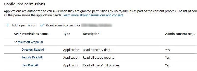
To call these Graph APIs, you need to register an Azure AD App and provide following permissions.
Create a Flow in Power Automate, fetch the records and add/update in the list. For first call, you will add the records in the list and for calls to other applications’ activity reports, you need to update the list items. You also need to check before adding a new record, if that user already exists in the list. In that case, you would just make an update.
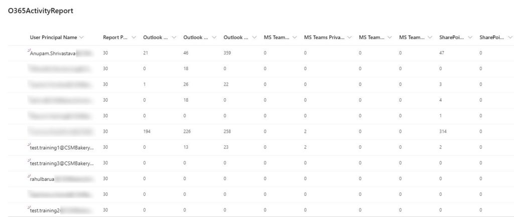
Once all your APIs calls return the data and inserted in the list, it would look something like this. The column names here are the actual parameters like Outlook Emails Sent, Outlook Email Received and so on…
Once everything is ready, you can schedule it to run run everyday, which will keep on updating this list with the usage data for all users for last 7 days.
You can decide if you want to track it for last 7 days or 30 days. In case of 30 days, just change the number of days in master list and get data for 30 days using the API by changing period=’D7′ to period=’D30′
Calculate Collaboration Score
Now that we have the raw data from various office 365 reports collated in a single SharePoint list, we can start the magic.
I came up with a simple excel sheet first to mimic the calculations.
What it essentially says that for each user, do the following:
- Get the total number of activities for a particular parameter, say Emails sent from the previous SharePoint list
- Multiply it with with the weightage of that parameter from master list
- Compare the output with “Max Possible Points” of that parameter from the master list
- If the output value is more than “Max Possible Points”, we assign the final value as Max Possible Points, else we provide the output value
- See Emails Sent: Activity count = 60, Max Possible = 70, so calculated points becomes 60
- See Meeting Count: Activity count = 70, Max Possible = 35, so calculated points becomes 35
- And finally to calculate the percentile, use sum of all calculated points for each application x 100 / sum max possible points
- See sum of Outlook, it’s sum of Calculated points x 100 / Sum of Max possible points: (60 + 70 + 70) x 100 / (70 + 70 + 70) = 95.23%
- You can now also calculate the total percentile of a user across all applications by just having sum of all percentages / total number of applications. From the above screenshot, it would be (95.23 + 80) / 2 = 87.61%
Remember the above calculation is for each user. So, your Power Automate needs to iterate through all users and perform these calculations. Use of Parallel actions will greatly increase the performance of your processing.
Create a separate SharePoint list and another Power Automate Flow to perform these calculations based on the raw data in SharePoint list and the master data list and store the final calculated percentage in another SharePoint list.
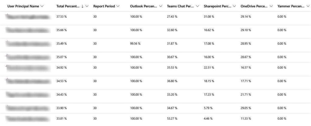
Great! Now we have all the users in a SharePoint list with their application wise as well as total collaboration score based on various activities they have done across various office 365 applications. Schedule it to run everyday, after your first flow and you will have a dynamic list always updated based on recent activities of users across applications.
If you just sort it by say column “Total Percentile”, you can easily find say top 100, most engaged users.
You can complement the data in the above list with additional profile information like Location, Manager, Country etc, by calling other APIs in Flow, which will help in better analysis like Top engaged users in a particular country, location etc.
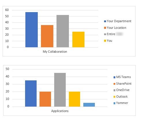
Collaboration Widget
We can take it to another level to visualize it. Get a PowerApps application and get some quick charts added based on the final calculated data. This is just a sample, but you get the idea, you can drill into all the activities and create as beautiful charts as possible.
And now you have your Collaboration Score, based on granular users activities, dynamically getting updated every day.
Not Interested in all of these?
Microsoft is also coming up with “Productivity Score” which looks into various parameters under various categories like Content Collaboration, Communication, Mobility etc. and provides organization wide score, but our approach gives us our own definition and granular control, so I intend to use it for some time to come.
There is also Office 365 Workspace Analytics you can look into for a different set of extensive analytics.
Hope this helps!
Enjoy,
Anupam